


For this assignment, we had to take or find pictures we took that represent a few different angles used in professional videography. As you can see, there are many medium, long and close up shots. Each having a unique angle. For example, in the second image I took of my friend, I used a high angle just to make him look more interesting. In the images of the dunes and the beach I took, they are bird’s eye view long shots. Those are the most interesting angles to my eyes. I love being able to see so much in very little space, but very simple.
30 Second Radio-Ad
https://drive.google.com/file/d/1BLJQZ7yUEZ4QwTWaJqFT8RodKvGrc0S_/view?usp=sharing
For this assignment, I partnered up with a classmate, which is why the ad had to be 1 minute long. The file is only a few seconds short.
We chose to do it on the record label business I own and run called Vibe Tribe Records. It was no where near the quality I would publish with, so it is just for fun.
Adding Audio to Video
https://drive.google.com/file/d/1GgmRlaukf_ynFwWN_-13oV1RdoH4r4hB/view?usp=sharing
For this assignment, we had to pick a silent film to create sound effects for. I decided on the Motorist.
I am a home music producer, so it was convenient that I already had a lot of sampled sound effects which I own.
I also decided to create an interesting spacey soundtrack that sort of matches the space scene.
I did not do any dialogue, because I wanted to show my ability in soundtracking.
I thought this assignment was a lot of fun!
8 Second Animation

For this final assignment, I had to create an 8 second long animation. I wanted to do something hip-hop, because I love the aesthetic of it. That’s why I chose the artist Lil Skies, who uses mainly butterflies and skulls in his brand.
To be honest, I completely hate the work I did. It didn’t turn out as cool as I wanted it too. I need more practice with motion tweening symbols, because they are not very smooth. It also didn’t help that I missed a day in class and most of the images I wanted to use were considered ‘inappropriate’ by the school. I am disappointed with the final product, but if I had more time I’d go back and do much better.
Motion Tweens

For this assignment, I took the walk cycle I created in the last one and added new layer to create a cool background. As I mentioned previously, I feel the movement of the walk is slightly un-natural which made me think of the physics of the moon. Hence, I chose walking on the moon.
I used Photoshop to add outer glows to the planetary bodies that produce and reflect light. After that I created a motion tween and moved them like I felt planets would. Animate did the rest for me. Notice the cool nebula in the back!
Walk-Cycle Animation

For this assignment, I had to create a character that walks like I do. To do so, I had my friend in class video me walking in the hall to use as a reference for drawing. The most difficult, but enjoyable task was creating the shoes. They contain the most detail. They are unique and colorful and I wanted them to stand out. It was my first attempt at creating a life-like animation, as you may be able to tell. I dislike how the shoulder/back bounces and the avatar does a slight ‘moonwalk’. I would spend more time to make sure it is smooth. To fix this I should create more symbols to level the consistency.
Movie Poster Assignment

For this assignment I first found an image of my favorite show/movie “Rick and Morty”. I ran out of time to fully finish it and polish it up, so I have it the way it is. I used adobe illustrator to illustrate all the characters on top of a black background. Including the text. After, I arranged it in Photoshop and added the galaxy I made from the previous assignment. I used in design to layer everything together. It still needs more time and a better picture, but I’m happy with its progress.
Outer Space in Photoshop

by: Parker Adams
To start this process, I had to create stars. Photoshop has cool built in textures and effects that made this easy. After adding the noise, I used free transform and hue/saturation to adjust the stars exactly how I thought would look good. Next, I added clouds using Photoshop’s cloud effect. I then overlayed a blue and red gradient and painted it with white to make it glow. Last I had to create planets using textures. Below are the images I took in my school to get these images. I used the paint bucket tool to fill my circle selection with my pattern. Then I spruced it up by adding an outer glow and inner shadow. I finished by twirling the cloud effect and free transforming it to look like a dust cloud for the planet.


Self Portrait with Adobe Illustrator


To start with this assignment, I first dragged in the before photo so I could trace it over with the pen tool. I like the appearance of an almost cartoon character, so I left out a few sharp details to give it a slightly less-realistic look. I wear a pink hat that I also wanted to illustrate and place on the avatar. I am also a big fan of the designer brand “Supreme”, so I incorporated it in to the design. I may put this design on a t-shirt for fun.
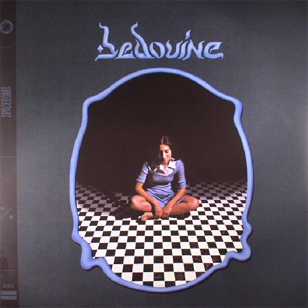
Reverse-Engineering Design


This design was pulled from the following website: https://cdn.pastemagazine.com/www/system/images/photo_albums/the-40-best-album-covers-of-2017/large/bedouine.jpg?1384968217
The woman in the image is the artist “Bedouine”. A popular Syrian singer/songwriter. This is cover art designed by her personal designer to advertise her style.
This design was designed as album cover advertisement artwork for a Syrian musician. I like the two styles of font very much actually. They are perfectly contrasting and placed nicely. Here, the main font would be considered more decorative, but I think in Syria, it is considered a standard serif font. But ultimately, it is a serif font because of the serifs it has on the end of the letters. It reminds me very much of the Middle-East and stereotypical India. It was a great font to represent her geographic. The font on the left that says “Spacebomb” is very much a modern sans serif font. The contrast in the fonts comes from the color, size and fade. You can barely tell there are two words on this art. It is a very well-done and clean design.
